
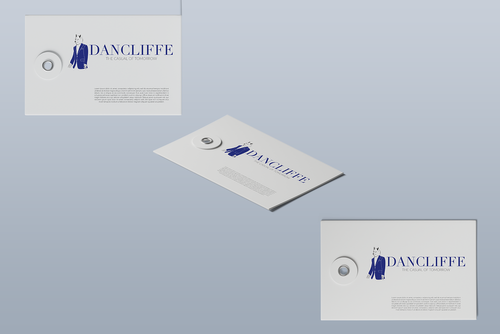
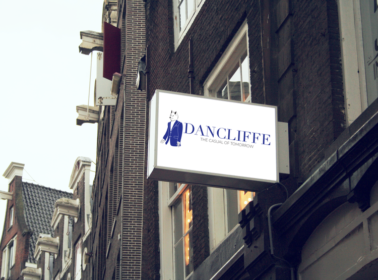
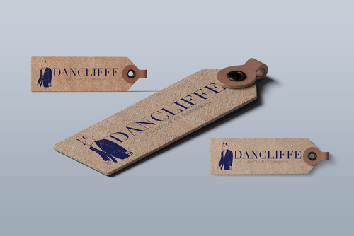
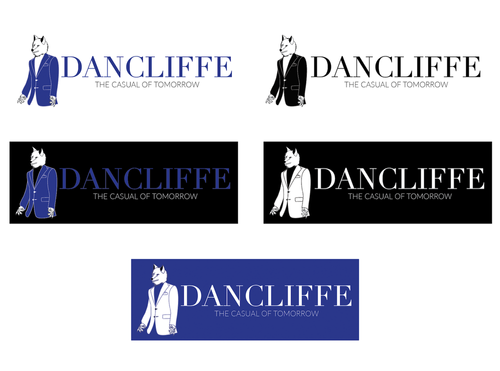
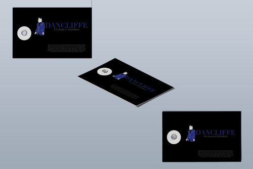
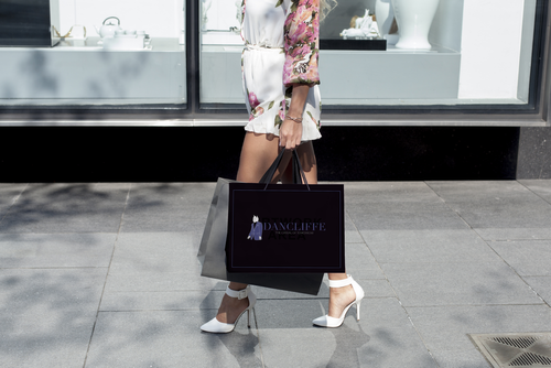
Dancliffe is the new iconic image I came up with for this project. DANCLIFFE is a combination of the actor, Daniel Radcliffe's name. DAN as in Daniel and CLIFFE as in Radcliffe. In this context, the logo, is very minimal, yet classy and formal as our tone of voice speaks luxury, class and haute couture. The blue colour is used along with black, representing Daniel Radcliffe's colour preference towards suits and blazers, which is navy blue and/or dark colours.
The wolf with a blazer, represents Daniel's spirit animal, the wolf, and the suit represents Daniel itself, as he loves wearing suits and blazer every time.


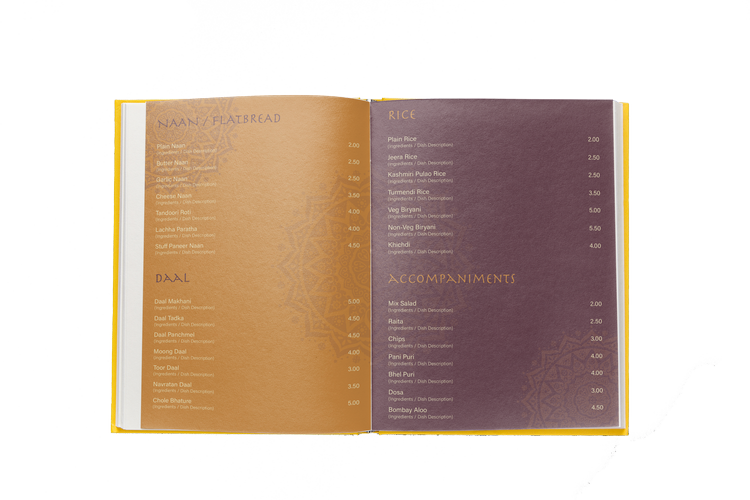
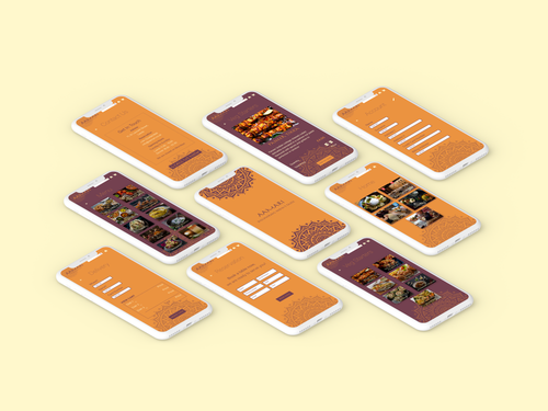
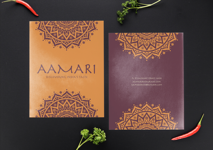
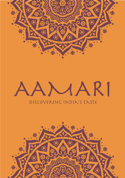
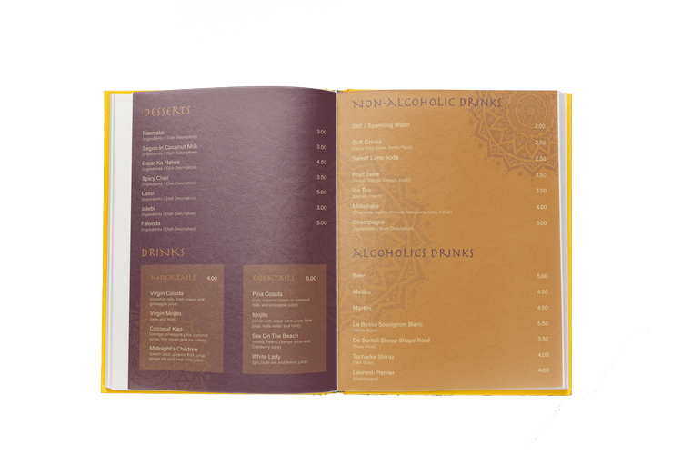
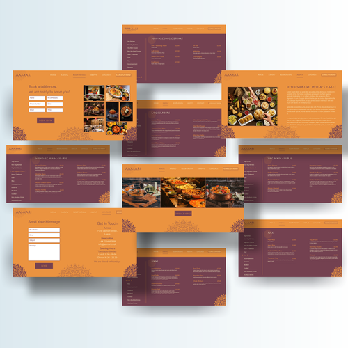
Aamari - Discovering India's Taste, is a fictional indian restaurant. For this project, I designed the logo, printed menu, the website and the phone app by giving it a signature look. For the whole concept, I used an Indian style mandala inspired from Rangolis with the yellow, it’s vivid, welcoming yet having the cultural indian factor. In fact, the yellow, I believe its a spicy vibe, as afterall that’s what indian food is all about, spices and spices. From the chosen swatches, I played around to have multiple combination still keeping the consistency and balance of the whole branding. India is a very big country with different culturals and colors, and these swatches for me represent a part of them.
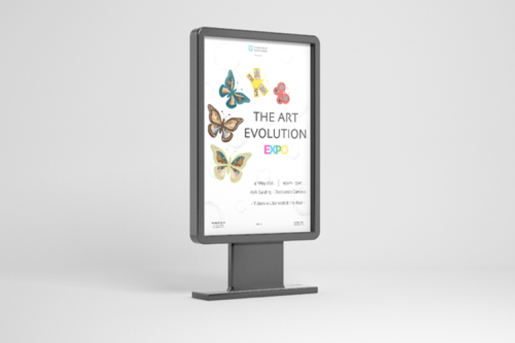
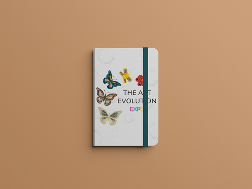
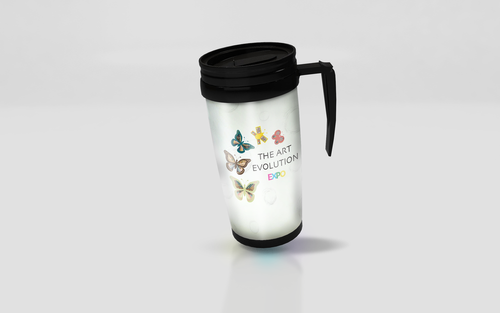
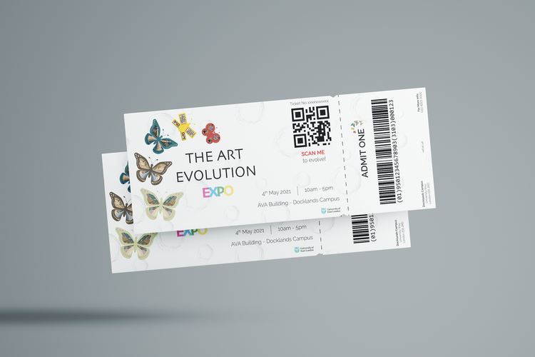
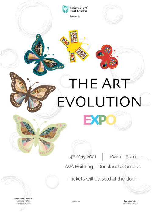
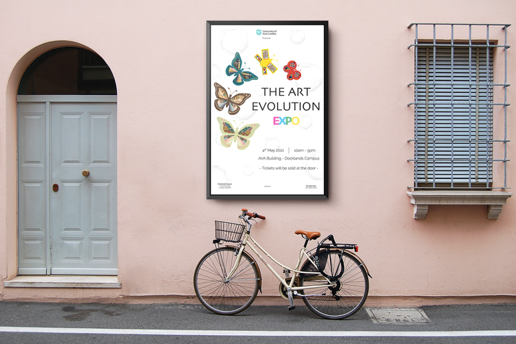
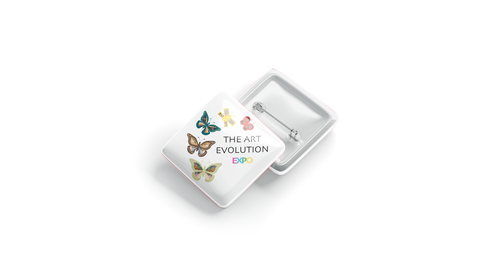
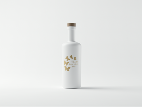
The aim was to create a Brand Identity, curation of artwork, art directing or collaboration of an exhibition. I’ve chosen to go for the Brand Identity, and created a unique piece of artwork. My artwork is about the art evolution, aka, Art Movement. I used butterflies to help me illustrate this evolution, as we can see on the posters, there are five butterflies, for which each represents an art movement. Moving upwards we first got Arts & Crafts, Art Nouveau, Art Deco, De Stijl and Bauhaus.
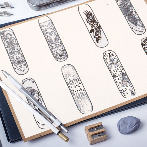
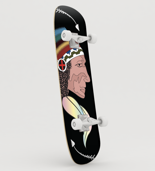
It all begins with an idea. For this project, I used the theme Ethnic, to design some skateboard decks, keeping in consideration colours, shape and illustration style.

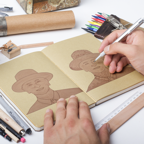
The main objective of this project was to create a desk calendar, being a Harry Potter fan, I’ve decided to do a Harry Potter themed desk calendar. How does it work? In this project 3 DIY wands where made, a brush wand and two to open the envelope, which includes a Hogwarts Admission Letter, 6 origami instructions and 6 calendar pages which at first they appear to be blank pages. Along with the envelope and wands, a handmade liquid was made as well. As shown in the video, the liquid needs to be brushed (or painted) on the blank paper to reveal the dates, which can then be folded and put on the table as a calendar. After each month has passed, each page can be turned into a Harry Potter collectible origami.
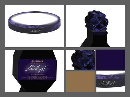
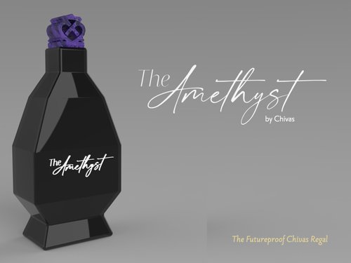
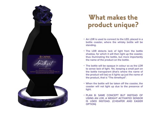
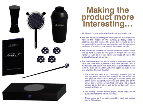
.jpeg)
.jpeg)
.jpeg)
.jpeg)
.jpeg)
.jpeg)
.jpeg)
.jpeg)